Standing in the paint aisle of your local DIY store, surrounded by hundreds of colour swatches that all seem to blur together, you’ve likely experienced that familiar wave of overwhelm. The perfect shade of grey that looked so sophisticated on Pinterest suddenly appears stark and clinical under the harsh fluorescent lights above. This moment of paralysis strikes even the most confident homeowners, because choosing the right colour for your walls isn’t just about personal preference—it’s about understanding how light, space, and lifestyle intersect with interior painting decisions that will influence your daily mood and comfort for years to come.
The consequences of getting it wrong extend far beyond mere aesthetics. A poorly chosen colour can make a spacious room feel cramped, drain the warmth from a cosy living area, or create an atmosphere that feels perpetually at odds with how you actually use the space. Yet when done thoughtfully, the right paint colour becomes an invisible architect, subtly shaping how you experience your home and how guests perceive your personal style.
Understanding Your Space’s Natural Personality
Every room in your home possesses an inherent character shaped by its architecture, natural light, and function. Before you even glance at a colour chart, spend time observing how your space behaves throughout the day. That north-facing sitting room that feels crisp and bright at noon may transform into something entirely different by teatime, when the lack of direct sunlight renders it cool and shadowy.
The direction your windows face plays a crucial role in colour selection. South-facing rooms bask in warm, consistent light that can handle cooler tones like blues and greens without feeling stark. These spaces often benefit from colours that provide a counterbalance to the abundance of natural warmth. Conversely, north-facing rooms receive cooler, more consistent light that can make warm colours appear muted or muddy, while cooler tones might feel uninvitingly cold.
East-facing rooms enjoy the golden embrace of morning sunshine but lose that warmth as the day progresses, making them ideal candidates for colours that maintain their vibrancy even as natural light fades. West-facing spaces come alive in the afternoon and evening, their walls practically glowing in the warm, slanted light that streams through the windows.
Consider also the room’s architectural features. High ceilings can handle darker, more dramatic colours that would overwhelm a compact space, while period features like original cornicing or picture rails can influence whether you choose colours that complement or deliberately contrast with existing elements.
The Psychology of Colour in Daily Living
The emotional impact of colour isn’t merely trendy psychology—it’s rooted in genuine physiological responses that affect your daily well-being. Warm colours like terracotta, sage green, or soft ochre can make a dining room feel more intimate and convivial, encouraging longer conversations over Sunday lunch. These hues seem to draw walls closer, creating a sense of enclosure that many find comforting rather than claustrophobic.
Cool colours, particularly the sophisticated palette of blues and greys so popular in contemporary British homes, can make spaces feel more expansive and serene. A soft powder blue in a bedroom doesn’t just look calming—it can actually help regulate your circadian rhythm and promote better sleep quality. However, these same cooling tones might leave a frequently used family kitchen feeling sterile and unwelcoming.
The key lies in matching colour psychology to room function. Your home office might benefit from colours that promote focus and creativity—perhaps a muted green that’s easy on the eyes during long work sessions, or a warm white that provides clarity without starkness. Children’s bedrooms require colours that can transition from energetic daytime play to peaceful evening wind-down, making mid-tone colours like soft peach or lavender more practical than bold primaries.
Navigating the Relationship Between Colour and Light
Paint colour and lighting form an inseparable partnership that can make or break your decorating efforts. The same paint can appear dramatically different under various lighting conditions, which explains why that “perfect” colour from the hardware store looks entirely wrong once you’ve painted an entire wall.
Artificial lighting adds another layer of complexity. The warm, yellowish cast of traditional incandescent bulbs enhances red and orange undertones in paint while dulling blues and purples. LED bulbs, increasingly common in British homes, typically emit cooler light that can make warm colours appear flat while bringing out the clarity in cooler tones.
Consider the lighting you’ll actually live with, not just the daylight streaming through windows when you’re making your selection. That rich burgundy might look magnificent in afternoon sunlight but could appear oppressive under the warm glow of table lamps during winter evenings.
Test your chosen colours at different times of day and under various lighting conditions before committing to entire rooms. Paint large swatches—at least A3 size—on different walls to see how the colour behaves in various lighting situations throughout your space.
Working with Existing Elements
Your home doesn’t exist in a decorating vacuum. Existing elements like flooring, kitchen worktops, bathroom fixtures, and built-in furniture all influence which colours will work harmoniously in your space. Honey-toned oak flooring, popular in many British homes, can clash terribly with certain paint colours while complementing others beautifully.
Rather than fighting against these permanent features, use them as launching points for your colour scheme. That avocado bathroom suite from the 1970s needn’t dictate an entirely retro colour palette, but acknowledging its warm, earthy undertones can guide you toward complementary wall colours that make the space feel intentional rather than dated.
Consider the visual weight of existing elements as well. Dark wooden beams or a prominent brick fireplace can handle bold paint colours that might overwhelm a space with lighter architectural features. These substantial elements actually provide visual anchoring that allows for more adventurous colour choices.
The Art of Testing and Commitment
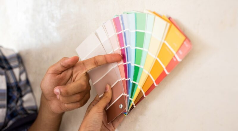
The difference between successful colour choices and expensive mistakes often comes down to proper testing methodology. Paint manufacturers design their colour cards to be viewed under optimal lighting conditions, but your home’s unique combination of natural and artificial light will transform any colour in ways that sample cards can’t predict.
Professional decorators often recommend the “live with it” approach: paint sample patches of at least one square metre in different areas of the room and observe them over several days. Notice how the colour changes throughout the day, how it looks under your evening lighting, and how it makes you feel during different activities in the space.
Don’t rely solely on small paint pots for testing. Instead, buy a larger sample tin that allows you to apply the colour properly with the same technique you’ll use for the final application. A thin, patchy application will never give you an accurate preview of the finished result.
Beyond Single Colours: Creating Flow and Connection
Modern homes often feature open-plan living areas that blur the boundaries between traditional room functions. In these spaces, colour choices must work harder to create both cohesion and definition. Rather than painting everything the same colour—which can feel monotonous—consider using variations within the same colour family to create subtle transitions between different functional areas.
The concept of colour flow becomes particularly important in British homes with their characteristic narrow hallways and interconnected rooms. A colour that works beautifully in isolation might feel jarring when glimpsed through doorways or along sightlines that connect multiple spaces.
Consider how colours will appear in relation to each other, particularly in transition areas like hallways and landings. These spaces offer opportunities to introduce accent colours or deeper shades that create visual interest while maintaining overall harmony throughout your home.
Choosing interior paint colours that truly work in your home requires patience, observation, and a willingness to move beyond immediate aesthetic preferences toward a deeper understanding of how colour functions within your specific environment. The most successful colour schemes don’t announce themselves boldly but rather create an atmosphere so perfectly suited to both space and lifestyle that they seem inevitable—as if your home couldn’t possibly look any other way.
The investment of time spent understanding your space’s unique characteristics and testing colours thoroughly pays dividends in creating a home that genuinely supports and enhances your daily life, rather than merely looking attractive in photographs.