In a world where property prices continue to soar and living spaces shrink accordingly, families across Britain are finding themselves grappling with rooms that feel more cramped than cosy. Yet within the confines of even the smallest bedroom, kitchen, or sitting room lies an untapped potential that doesn’t require knocking down walls or extending into the garden. The secret weapon in transforming these intimate spaces into seemingly expansive havens is remarkably simple: small room painting strategies that leverage the extraordinary psychological power of colour to fool the eye and lift the spirit.
What many homeowners fail to realise is that colour operates as a form of visual magic, capable of pushing walls outward, lifting ceilings skyward, and creating an atmosphere of openness where none existed before. The relationship between colour and spatial perception isn’t merely aesthetic folklore passed down through generations of decorators—it’s grounded in solid psychological research and centuries of architectural wisdom. When applied thoughtfully, the right paint choices can transform a poky box room into a bright retreat, or turn a narrow galley kitchen into what feels like a chef’s spacious domain.
The Science Behind Spatial Illusion
The phenomenon of colour affecting our perception of space operates on multiple levels of human psychology and visual processing. Research conducted at university residence halls has demonstrated that colours significantly affect how we perceive room lightness and our overall satisfaction with interior spaces. When light hits a painted surface, the wavelength of that reflected light travels to our brain, where it’s processed not just as colour information, but as spatial data that influences our sense of scale and dimension.
Light colours like off-whites, light neutrals, pales, and pastels give the illusion of larger, brighter rooms because they reflect more light back into the space. This reflection creates what interior designers call “bounce light”—illumination that seems to emanate from the walls themselves, softening harsh shadows and eliminating the visual boundaries that make small rooms feel confined. Conversely, darker hues absorb light, creating depth but potentially making boundaries more defined and spaces feel more enclosed. The key lies in understanding how to harness these properties strategically rather than simply defaulting to magnolia walls throughout the home.
Light Colours: The Traditional Space Expanders
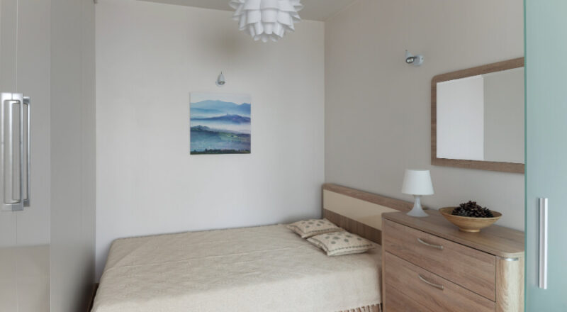
White remains the undisputed champion among colours that expand space, though not all whites are created equal. Charleston interior designer Megan Molten’s signature shade, Benjamin Moore’s Chantilly Lace, creates “the perfect bright white—creating the ideal backdrop for that clean, coastal, and airy feel”. The brilliance of pure white lies in its ability to reflect nearly all light that hits it, creating an almost ethereal quality that seems to dissolve physical boundaries.
However, the white family extends far beyond basic brilliant white, offering homeowners a sophisticated palette of options. Whitney Leigh Morris recommends White Tie by Farrow & Ball, noting it “can brighten and enlarge a room while making it feel warm and welcoming” due to its subtle undertones. Off-white variations, particularly those with the faintest hint of warmth, prevent the sterile, clinical feeling that can make small spaces feel unwelcoming rather than expansive. Soft greys and gentle beiges serve similar space-expanding functions whilst adding more character and sophistication to a room’s palette.
Cool Colours: Creating Depth and Distance
The cooling spectrum of blues, greens, and soft purples operates on a fascinating principle of visual recession. “Blues recede, which can give the illusion of opening up a space,” explains Molly Lynch, a Benjamin Moore colour expert. This phenomenon occurs because cool colours naturally appear to step back from the observer, effectively pushing walls away and creating the perception of additional square footage.
Peter Spalding, interior designer and co-founder of Daniel House Club, particularly favours “a very soft, airy blue-gray hue” because “it sort of feels like the sky, which suggests that perhaps your space is infinite”. The psychological association between pale blues and endless skies creates an unconscious expansion of perceived space. Similarly, sage greens bring natural tranquillity whilst maintaining the recessive qualities that make rooms feel larger. These colours work particularly well in north-facing rooms that receive cooler natural light, where warmer tones might appear muddy or dull.
The Surprising Power of Dark Colours
Whilst conventional wisdom suggests avoiding dark colours in small rooms, contemporary interior design challenges this assumption with striking results. Contrary to popular belief, darker, saturated hues can add instant depth to a room when used strategically. The key lies in creating what designers call “envelope painting”—using the same dark tone on walls, ceiling, and even built-in furniture to blur the boundaries of the space entirely.
Houston designer Jennifer Barron advocates for Farrow & Ball’s Down Pipe, a warm, dark gray, explaining that “the depth and darkness of the color are inviting, yet allows the space to feel much larger than if it had been painted a lighter color”. This technique works by eliminating the visual breaks that typically define a room’s limits. When everything is painted in the same sophisticated dark tone, the eye cannot easily distinguish where walls end and ceiling begins, creating an enveloping, cocoon-like effect that paradoxically feels spacious rather than claustrophobic. This approach works particularly well in rooms with interesting architectural features or abundant natural light.
Understanding Undertones and Temperature
The temperature of a colour—whether it leans warm or cool—plays a crucial role in spatial perception beyond the obvious choice between light and dark tones. Cool hues, such as shades of blues and greens, evoke a tranquil and expansive ambiance, whilst warm colors, like reds and oranges, infuse a room with a sense of intimacy which can make your space feel small and closed off. This principle becomes particularly important when working with neutral colours, where subtle undertones can significantly impact how spacious a room feels.
Greige—the popular combination of grey and beige—demonstrates how undertone temperature affects spatial perception. Julia Marcum of Chris Loves Julia explains the transformation from Benjamin Moore’s Chelsea Gray to Olympic Mountains, a light, warm greige: “Our room feels like it can breathe now”. The slightly warmer undertones in the new choice prevented the cool, receding quality from becoming stark or unwelcoming, whilst maintaining the space-expanding benefits of a light neutral. Understanding these nuances allows homeowners to select colours that feel both spacious and livable.
Strategic Application Techniques
The method of paint application can be just as important as colour selection in maximising spatial impact. Colour expert Arianna Cesa recommends using “soft pales on the upper part of the wall, and off-white paint colors on the lower part of the wall” to add height to any room. This technique, often combined with higher-than-traditional wainscoting, draws the eye upward and creates the illusion of additional ceiling height.
One paint trick that never fails is to paint the ceiling, trim, and doors in the same color to give the impression of space. This monochromatic approach eliminates visual interruptions that typically break up a room’s flow, creating a seamless envelope of colour that expands perceived boundaries. Additionally, the choice of paint finish affects light reflection: semi-gloss and satin finishes reflect more light than flat paints, contributing to the overall brightness and apparent spaciousness of a room. However, these sheens also highlight imperfections, so proper wall preparation becomes crucial for achieving the desired effect.
The transformation of small spaces through strategic paint choices represents one of the most accessible yet impactful improvements any homeowner can undertake. Whether embracing the clean expansiveness of carefully chosen whites, the recessive tranquillity of cool blues and greens, or the surprising sophistication of envelope-painted dark tones, the key lies in understanding how colour interacts with light, psychology, and architectural features to alter spatial perception.
The beauty of paint as a space-expanding tool extends beyond its immediate visual impact to encompass the psychological benefits of living in environments that feel open, bright, and thoughtfully designed. For families navigating the challenges of contemporary living in smaller homes, these colour strategies offer a pathway to spaces that not only function better but genuinely feel more comfortable and welcoming. In an era where every square foot counts, the humble pot of paint emerges as perhaps the most powerful tool in the modern homeowner’s arsenal for creating the illusion of space where it’s needed most.